Allevita
Building a women's health brand from the ground up with Allevita

Overview
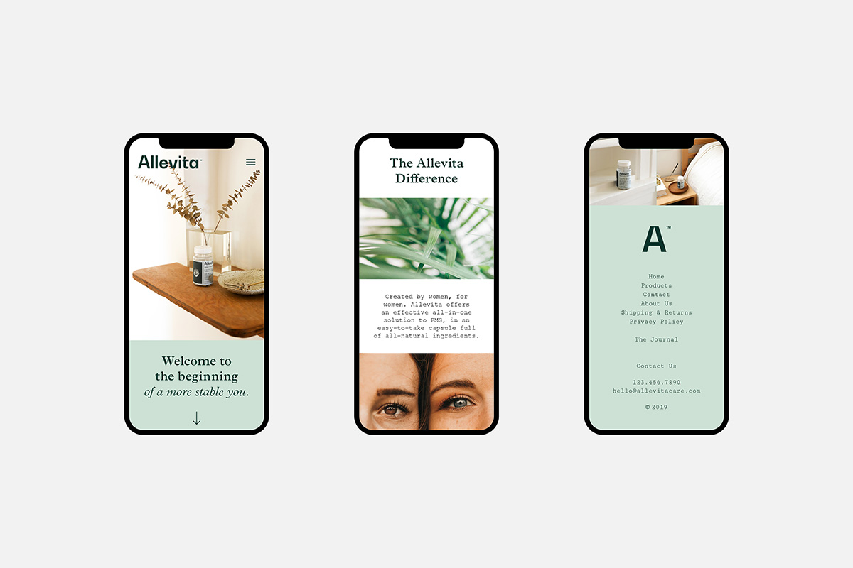
Allevita was developed as a wellness brand centered on women’s experiences of care and balance. Designed for period supplements, the identity needed to communicate reassurance and confidence without leaning on familiar category signals. The resulting brand language is calm and composed, allowing the products to feel supportive and approachable rather than prescriptive.
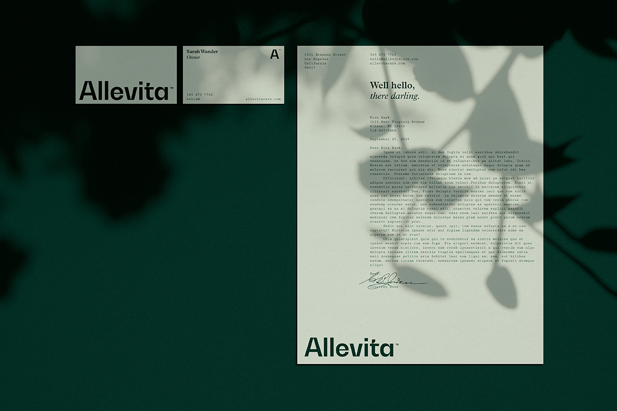
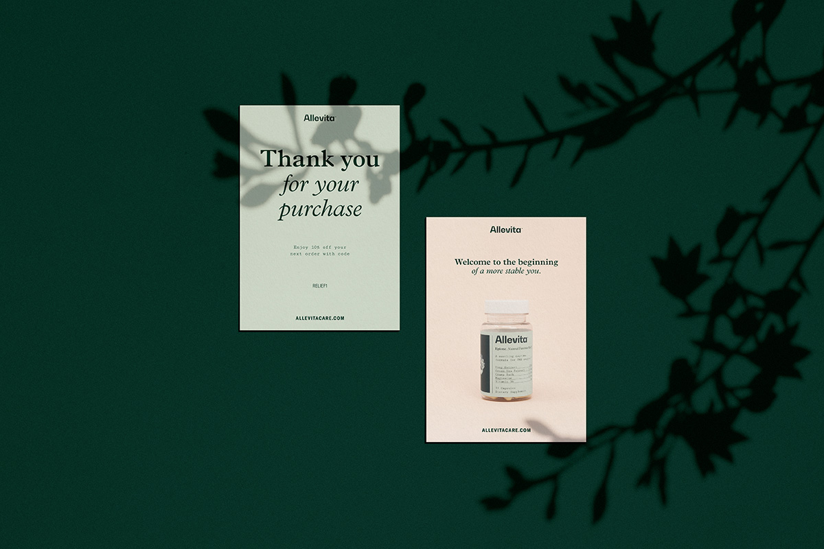
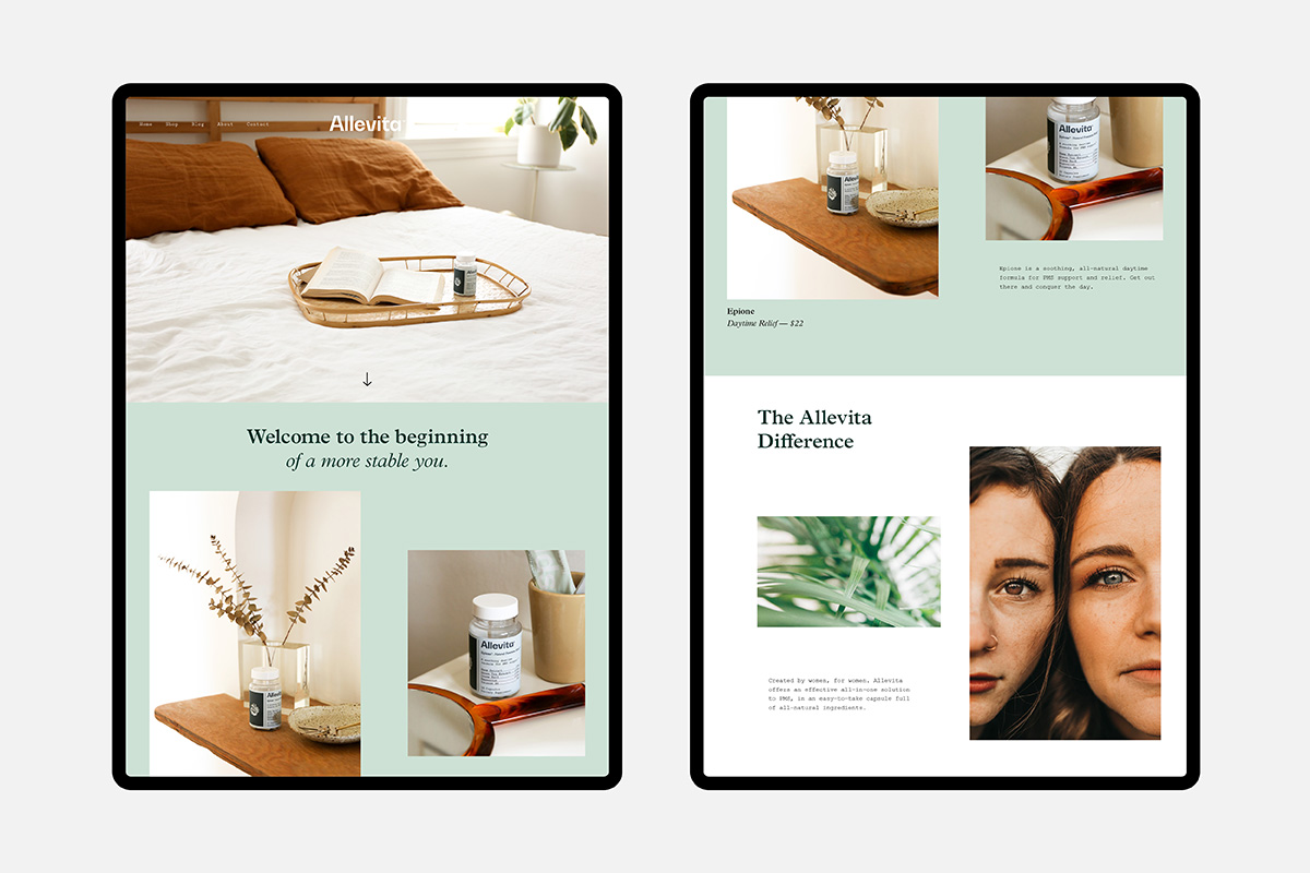
The brand was developed holistically across naming, packaging, and visual identity. Typography, color, and material choices were refined to feel clear, gentle, and trustworthy on shelf and in hand. The packaging balances softness with structure, reflecting an approach to wellness rooted in care and consistency. The result is an identity designed to integrate naturally into everyday routines and remain relevant over time.
Services
Retail Packaging
Sector
Health
Designed to feel calm and inclusive, the brand speaks across different experiences without relying on familiar category cues. Care and connection are communicated through restraint rather than instruction.
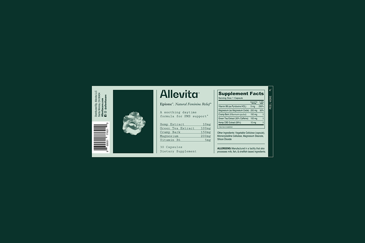
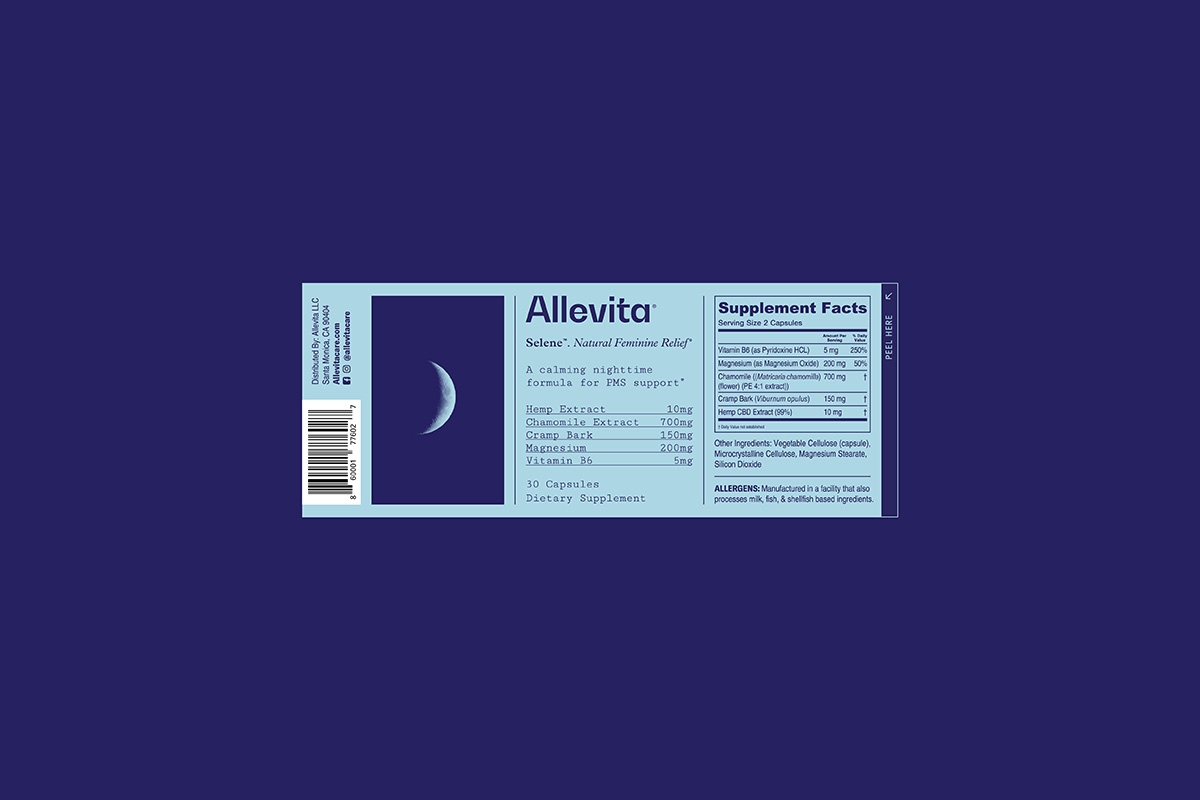
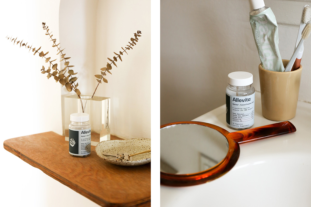
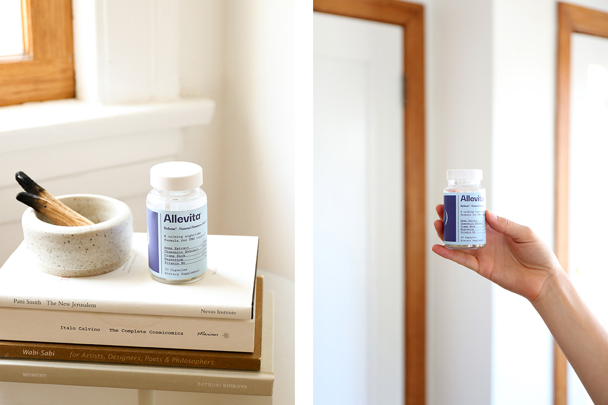
The brand balances softness with structure, creating a sense of reassurance without relying on overt signals. Through restrained typography and packaging, Allevita establishes trust at first encounter and over time.