Chimes
Refreshing the look of a fan favorite ginger chew brand
Overview
A refreshed identity was developed for Chimes to bring greater clarity and character to a familiar product. The work focused on defining a visual language that feels direct and approachable, using controlled graphic decisions to communicate flavor and energy without excess.
Brand identity, packaging, and web design were developed together to ensure consistency across how the brand is encountered. On shelf, the packaging emphasizes legibility and distinction, while the digital experience carries the same tone and graphic logic. The result is a contemporary brand presence that feels clear, confident, and cohesive across physical and digital touchpoints.
Services
Retail Packaging
Design & Innovation
Sector
Food & Beverage
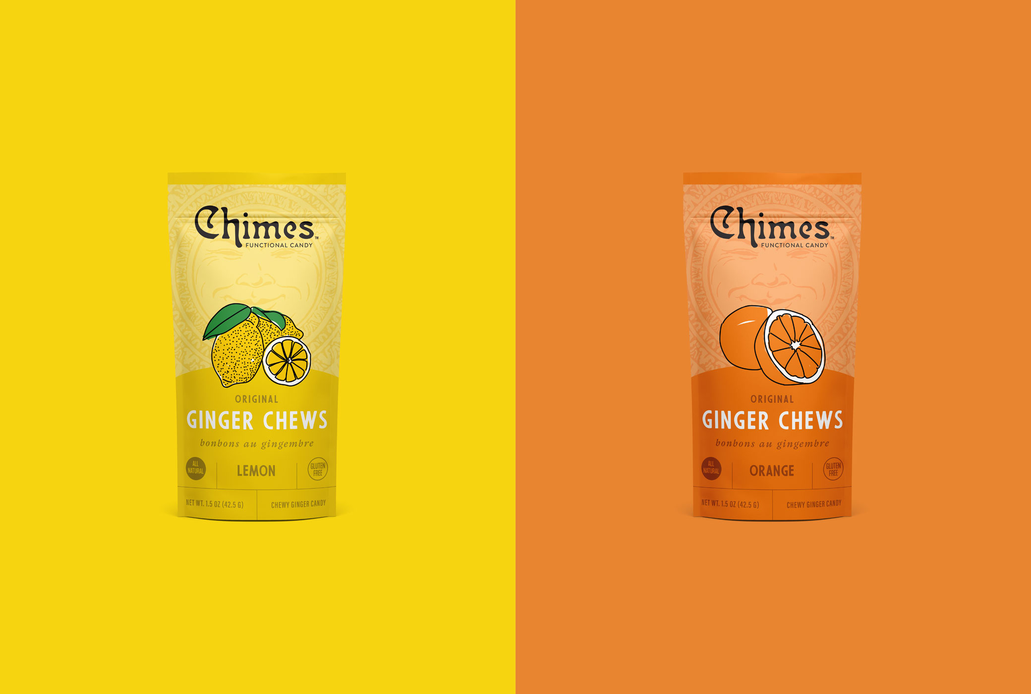
Straightforward packaging design paired with playful expression refreshes the brand across shelf and screen.