Friday Beers
Working with Almost Friday to brand a tasty light lager
Overview
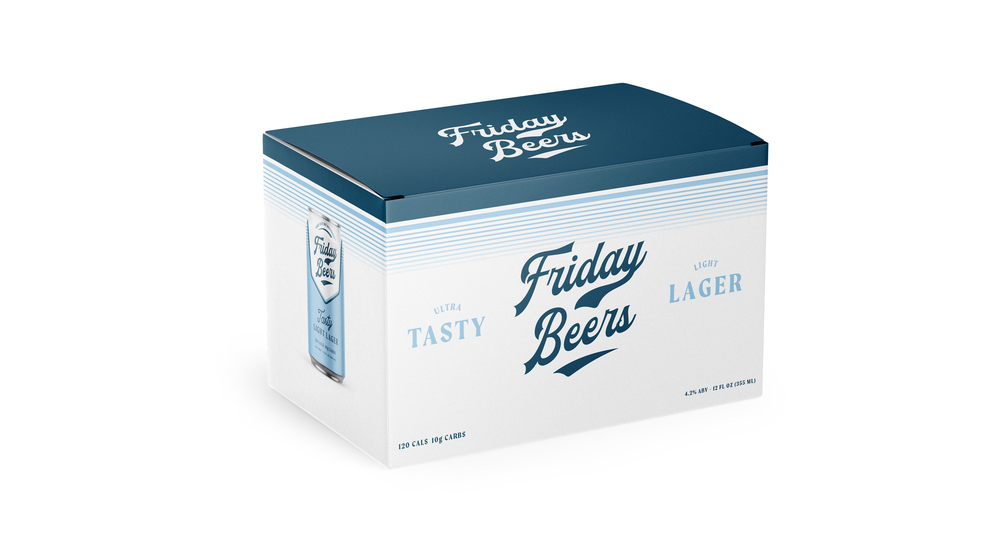
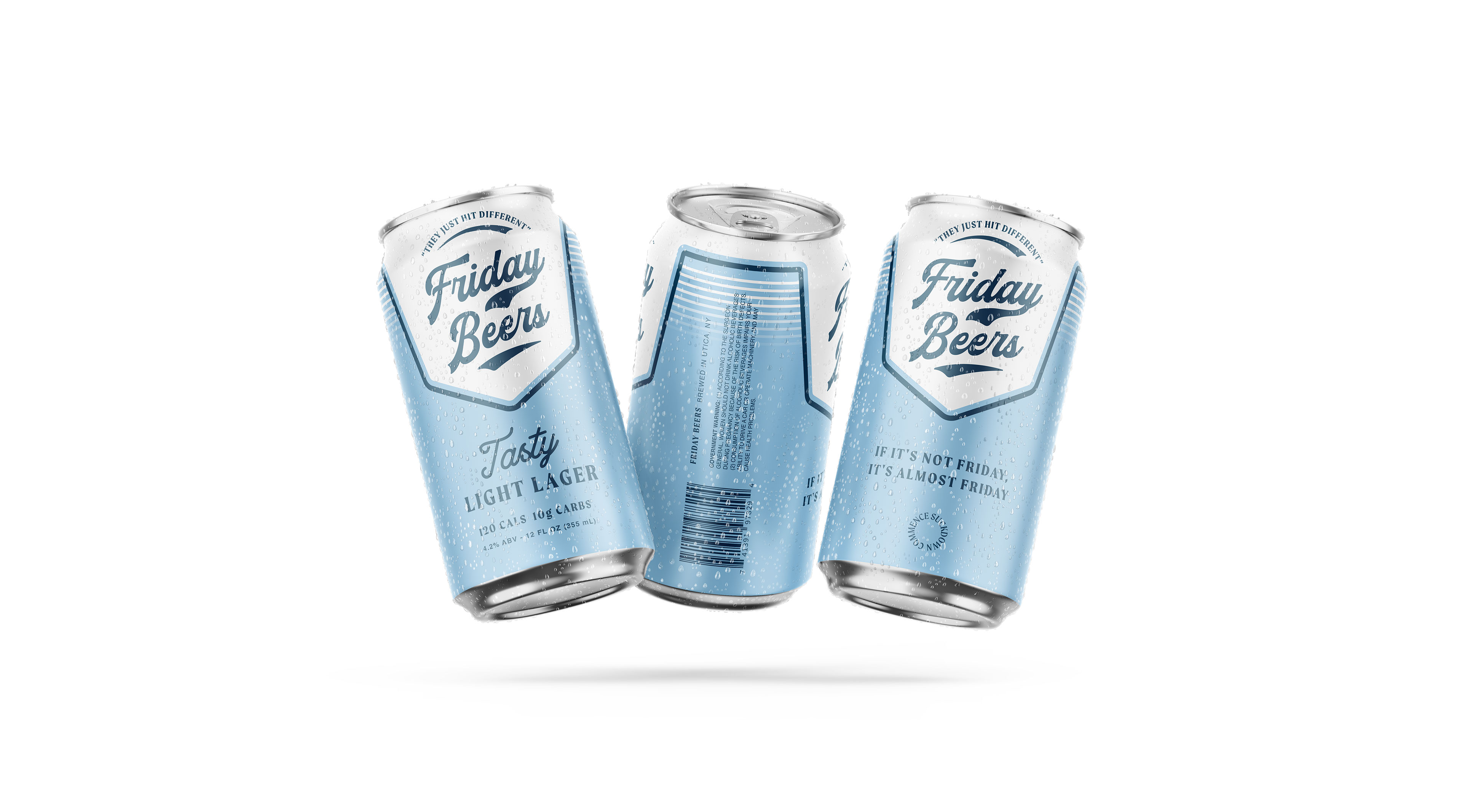
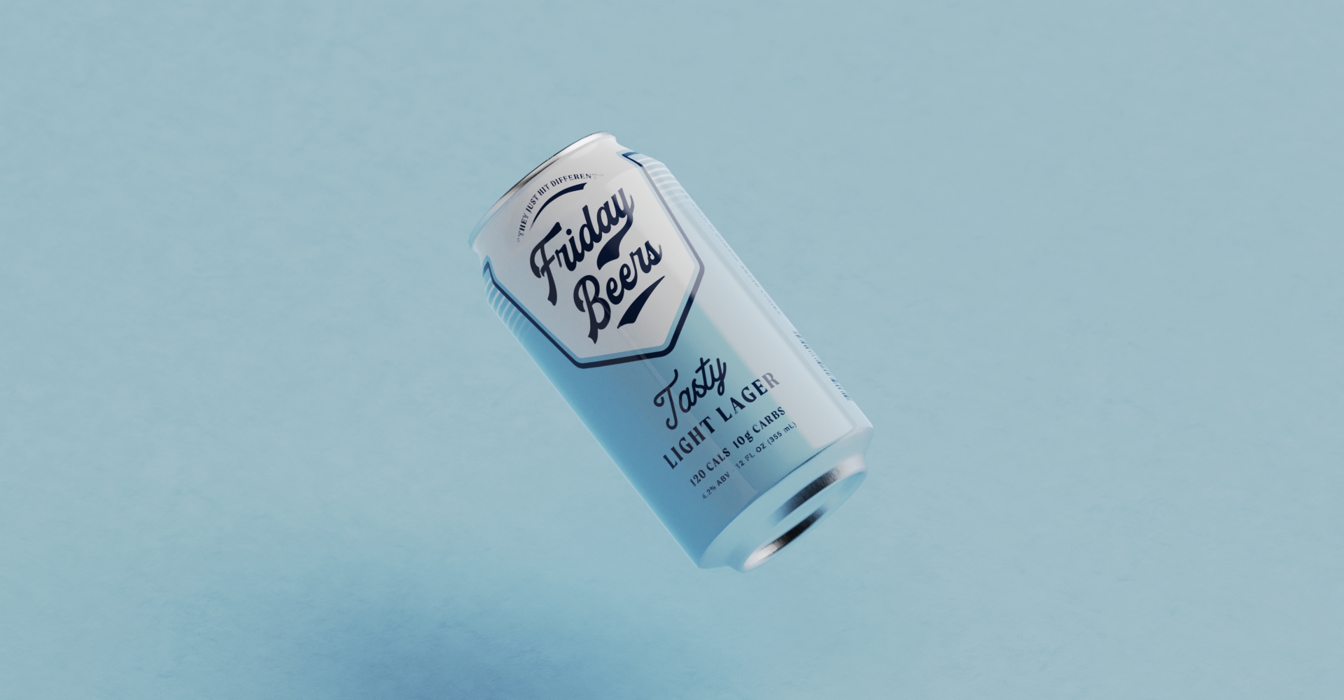
Our collaboration with Friday Beers marked a shift from screen-based presence to physical expression. Known primarily through social media, the brand had never been asked to exist as an object or system. The work began by establishing a clear foundation, allowing the identity to move into products and packaging without leaning on internet-specific cues or one-off novelty.
The focus was on building a physical language that could carry the brand’s confidence and humor through form, graphics, and tone. Design decisions were made to feel intentional and repeatable, giving the brand room to expand while staying recognizable. The result is a physical identity that translates the voice of Friday Beers into the real world with clarity and control, supporting growth without losing its edge.
Services
Retail Packaging
Sector
Food & Beverage
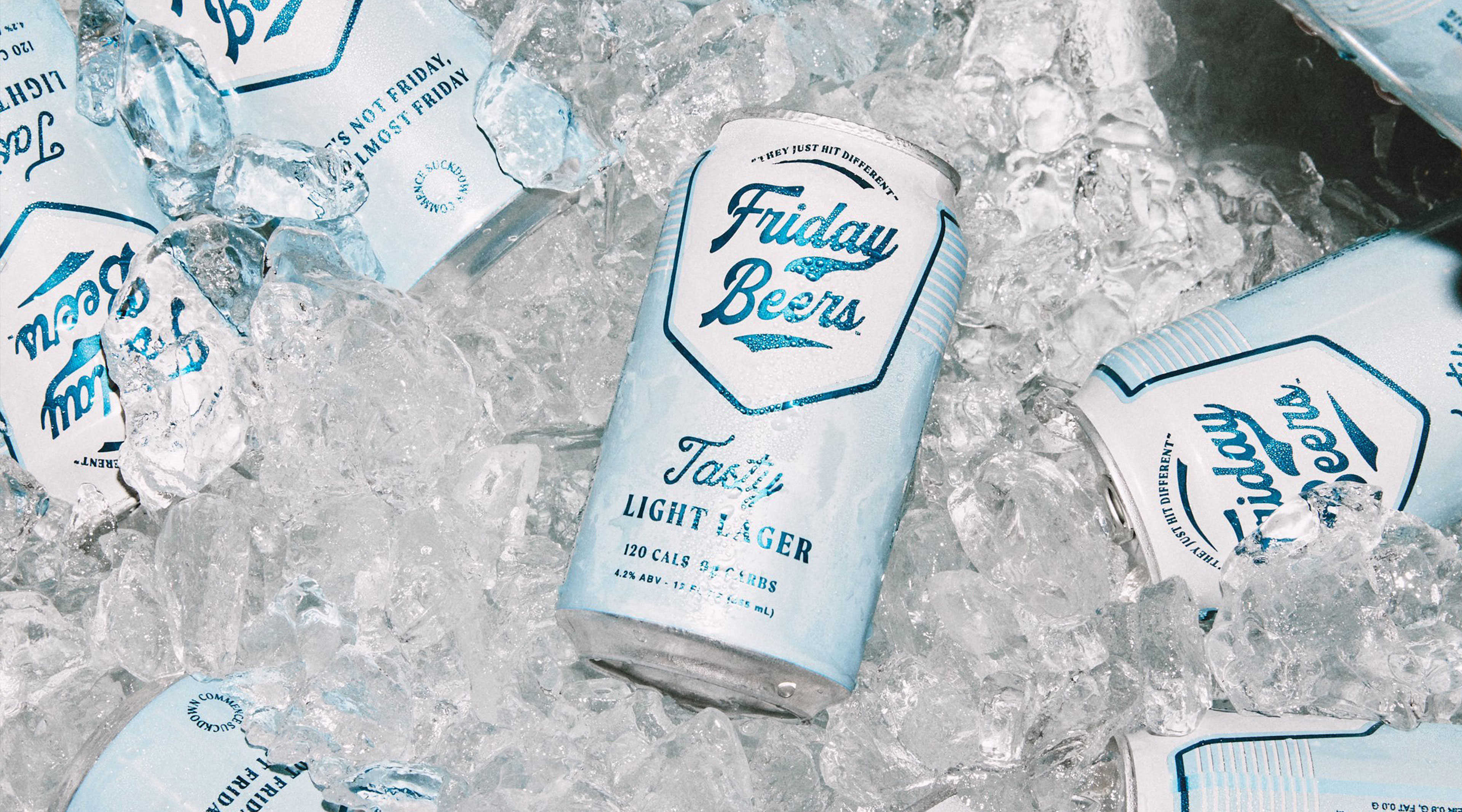
Friday Beers approached us with the challenge to design a beer brand that was timeless and classic but also had a modern sensibility. They were serious about the brand not feeling stale or old, something they could stand behind and stay true to their brand. They didn't want to pull any punches with the design and was one of the reasons they came to RISTICH.
|
|